Store Page Redesign
Web App Design
E-Commerce
A redesigned product page that improved engagement by aligning product experience with use cases.

Timeline
1.5 Months
Tools
Figma
My Role
Usability Test
Product Design
Web Design
Work Project
Product Manager*1
Product Designer*2
Software Engineer*2
QA Engineer*1
Background & Goal
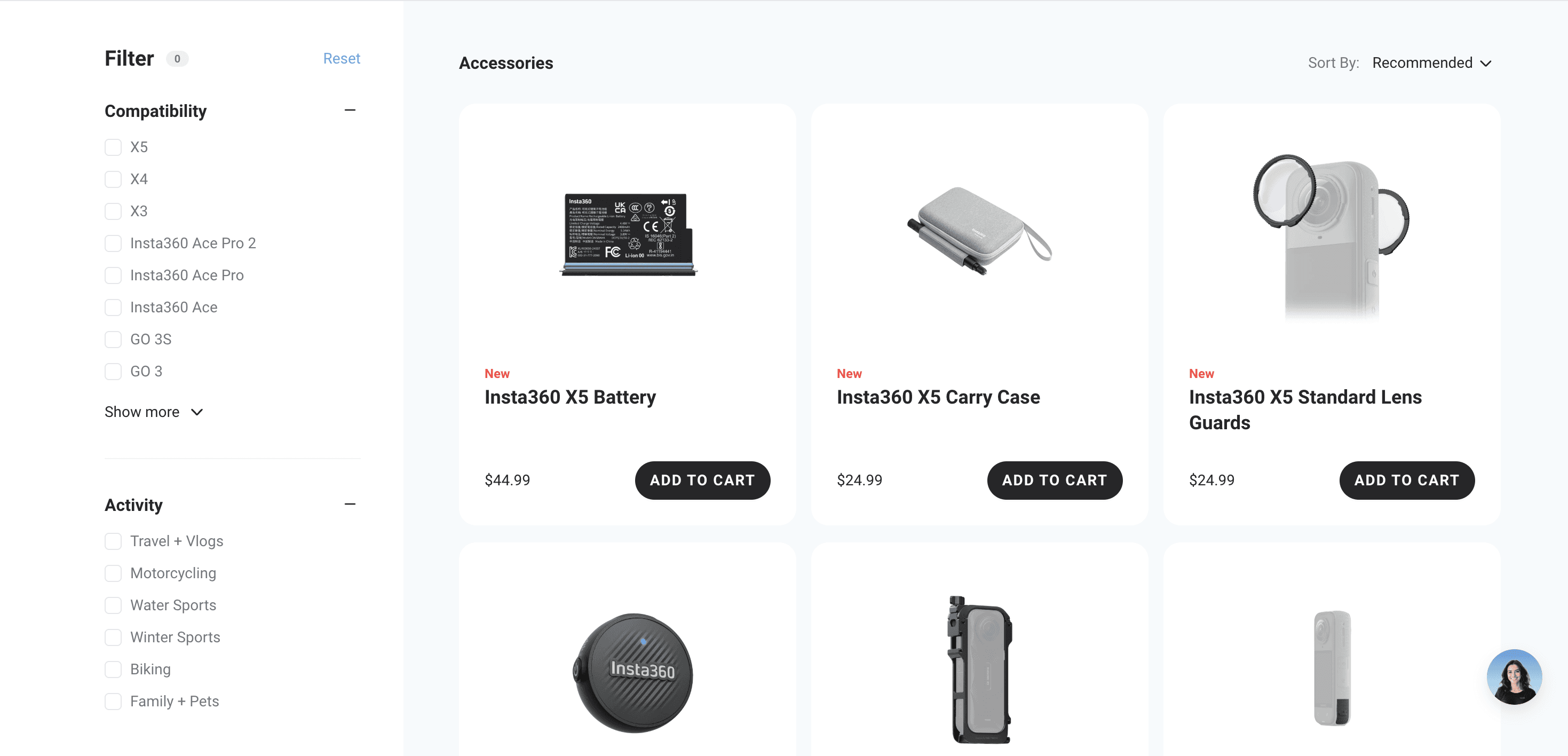
At Insta360, I was tasked with optimizing the Accessories page. Unlike other product pages, it had low engagement and high bounce rate.
Objective:
Enhance product discoverability and emotional connection by redesigning the layout and messaging, finally aiming to:
(1) Reduce bounce rate, (2) Increase session duration, (3) Improve conversion.
Key Pain Points
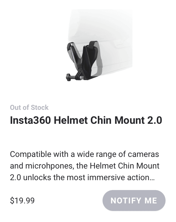
“I can’t tell what these accessories do.”
“Nothing really makes me want to click.”
Small images and vague descriptions made the page hard to browse.

Users couldn’t tell what many accessories were for and shows little emotional connection with them.
Ideation
Through user testings, I found that participants responded better to relatable scenes (e.g. skiing) than just product specs that’s difficult to read.

💡 The accessories lacked context, both visually and functionally, which made them unappealing and confusing. Therefore:
· How to group accessories: by use case (e.g. skiing, cycling) vs. by category (e.g. mounts, cables).
· How large and prominent visuals should be: can they better convey action and usage scenarios?
· What messaging works best: functional naming vs. value-based storytelling (“Secure your ride”, “Protect your lens”).
Design Exploration
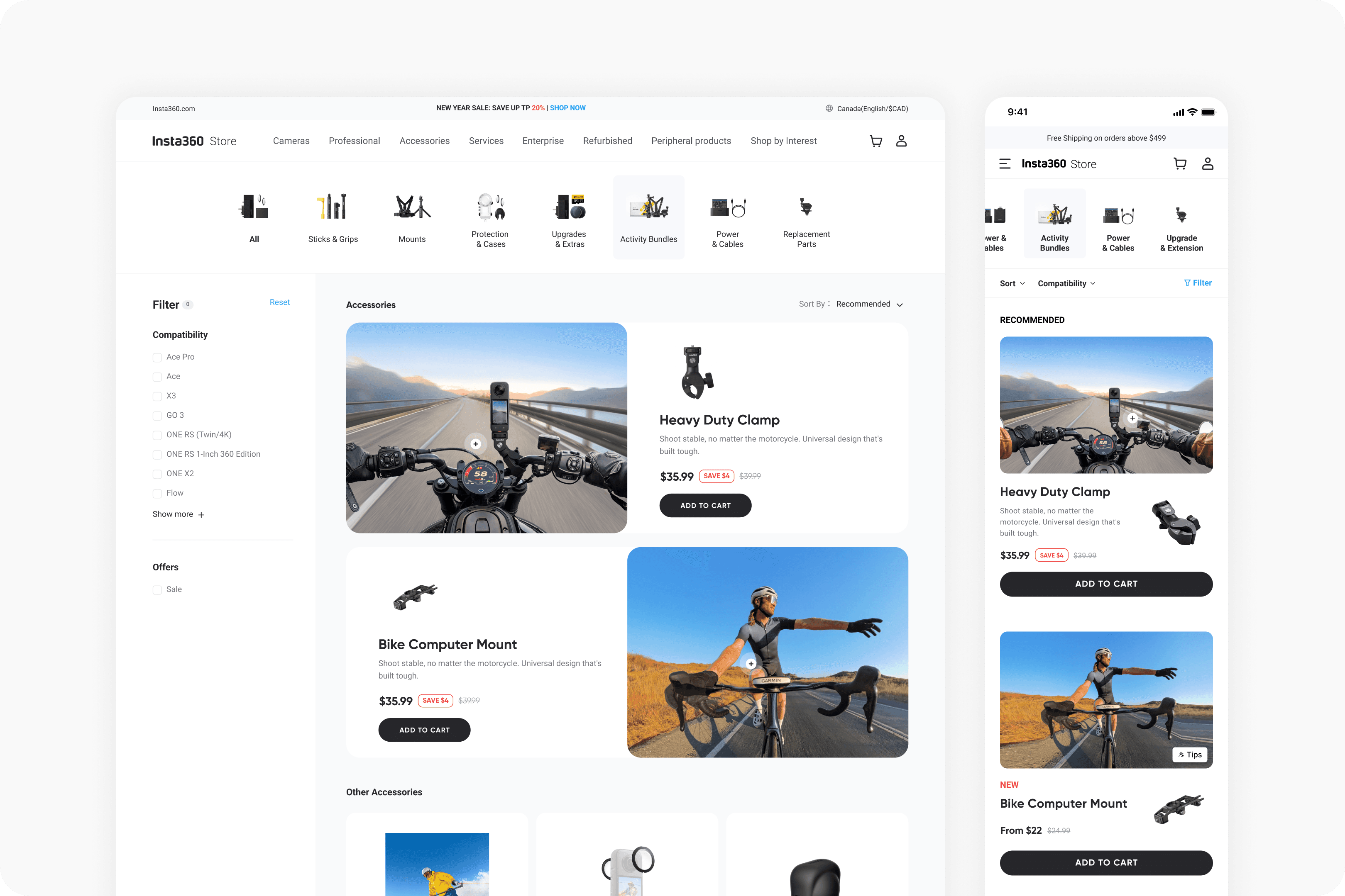
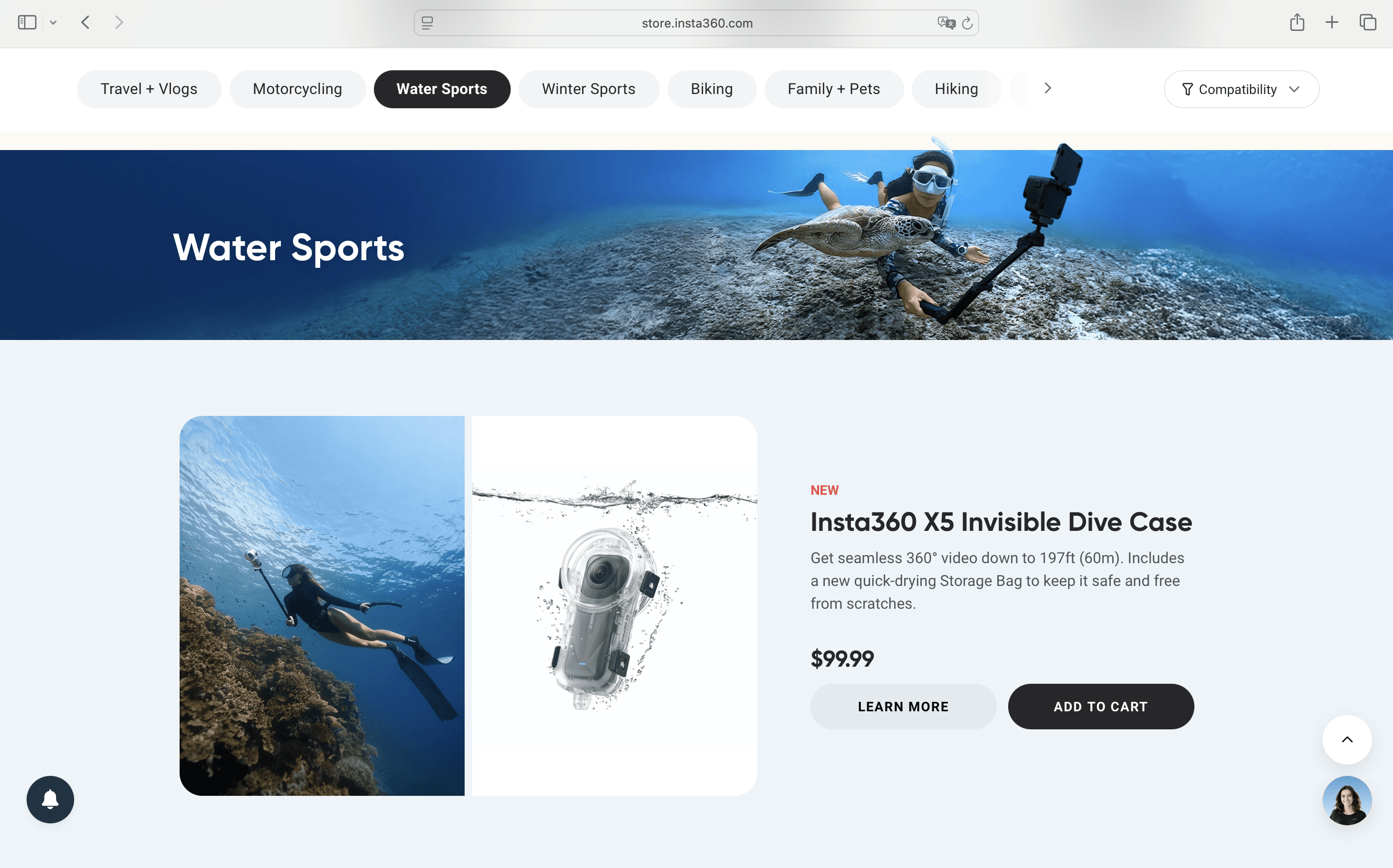
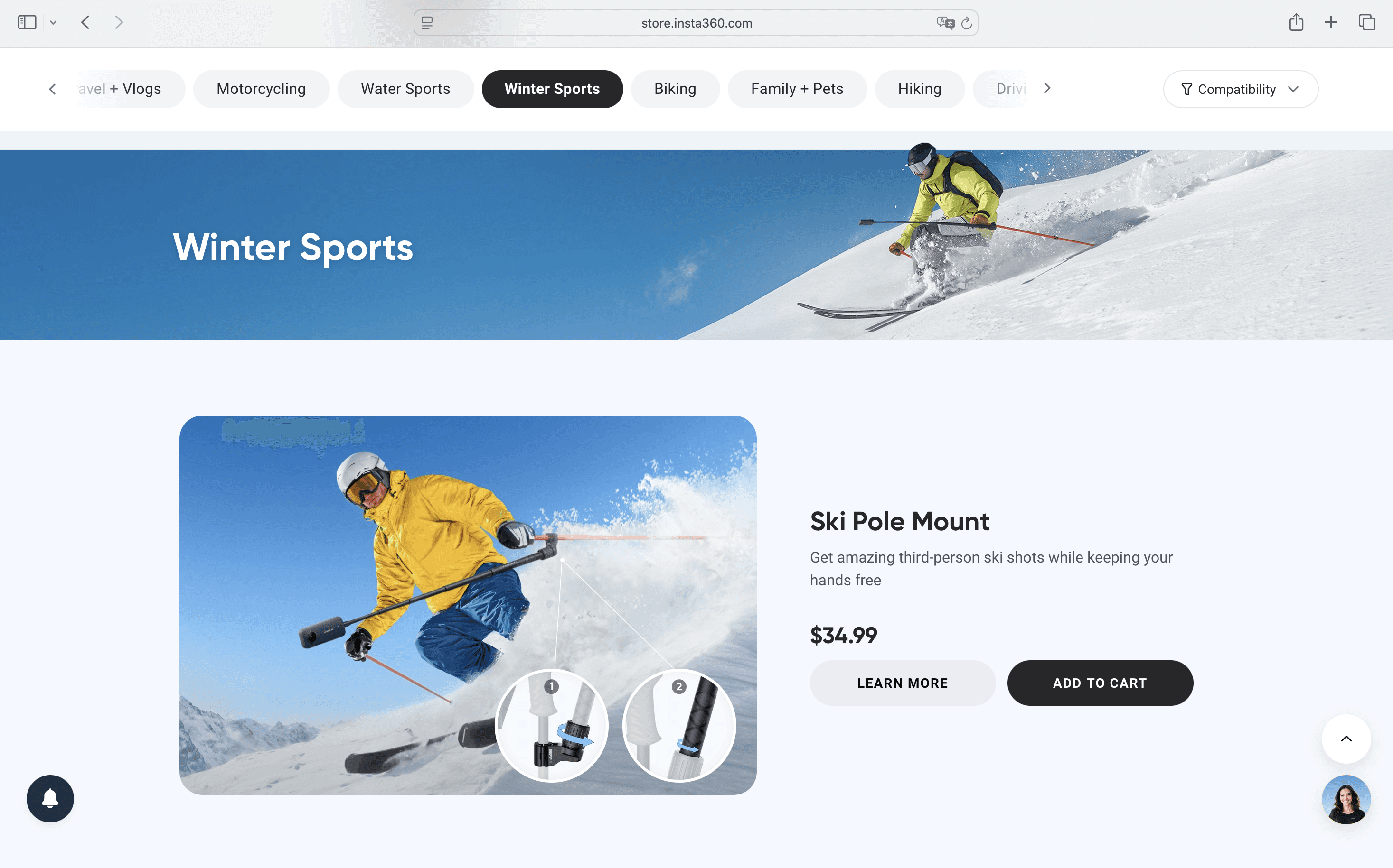
To help users better understand and connect with each accessory, I explored different layouts. All centered around organizing products by real-life use cases (e.g. skiing, biking, vlogging). Each variation tested a different balance of information & scannability.
Exploration A – Large Visuals
Pro: Most engaging and intuitive to casual users. Con: Long scroll, and functional info could get buried.
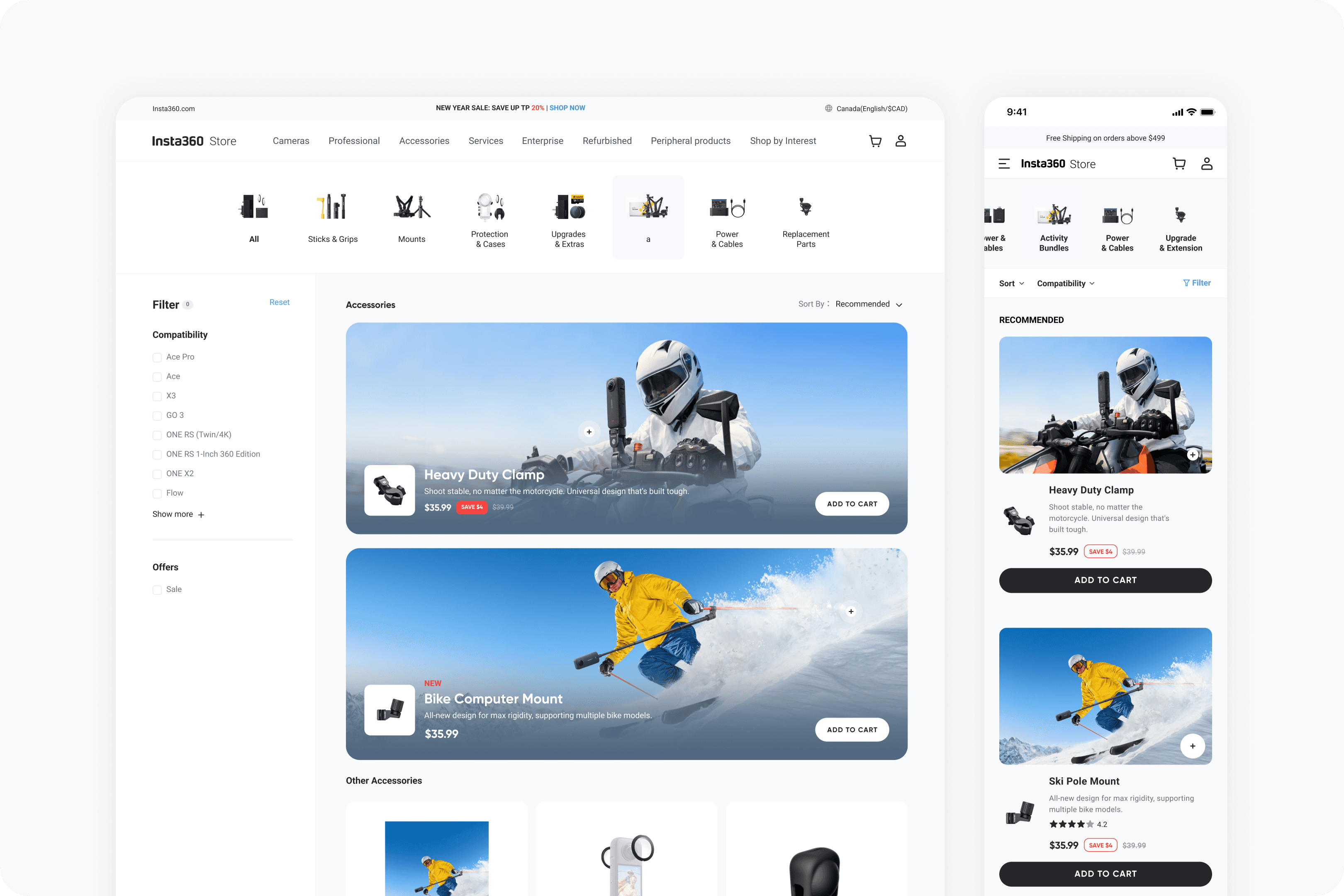
Exploration B – Alternating Layout
Pro: Clear separation of scenes, better storytelling. Con: Clear structure, but didn’t help users focus on what mattered most.
Exploration C – Basic Grid
Pro: Easy to scan and maintain. Con: Felt like a generic product list.

Final Solution
After internal peer reviews and feedback sessions with PMs:
We combined the strengths of Explorations 1 and 2 in the final design.

Data Improvements
-11%
Bounce Rate
+15.27%
Time on Page
+5.3%
Conversion Rate
Reflections
This redesign taught me that great UX isn’t just about structure.
It’s about storytelling. When users understand a product’s value in their own context, they’re far more likely to engage and convert.
Thank you for visiting👋🏻 Copyright © 2025 Jinjin Du, All Rights Reserved