FlexiCare Revamp
Web App Design
Customer Support
A revamped after-sales service that reduced turnaround time and made camera replacements smoother.
Timeline
2 Months
Tools
Figma
My Role
Usability Test
Product Design
Web Design
Work Project
Product Manager*1
Product Designer*1
Software Engineer*3
QA Engineer*1
About FlexiCare
Insta360 is a global action camera brand. In 2024, it launched FlexiCare, a premium after-sales service designed to offer camera replacement.

Business Problems
Our customer support team always prioritizes user satisfaction,
yet FlexiCare continues to receive complaints.
The service is originally designed to offer convenience and drive revenue. However, negative experiences in the flow have led to complaints, refund requests, and reduced future revenue potential.
Complaints + Refund ↑
Online Support

Willingness to pay ↓
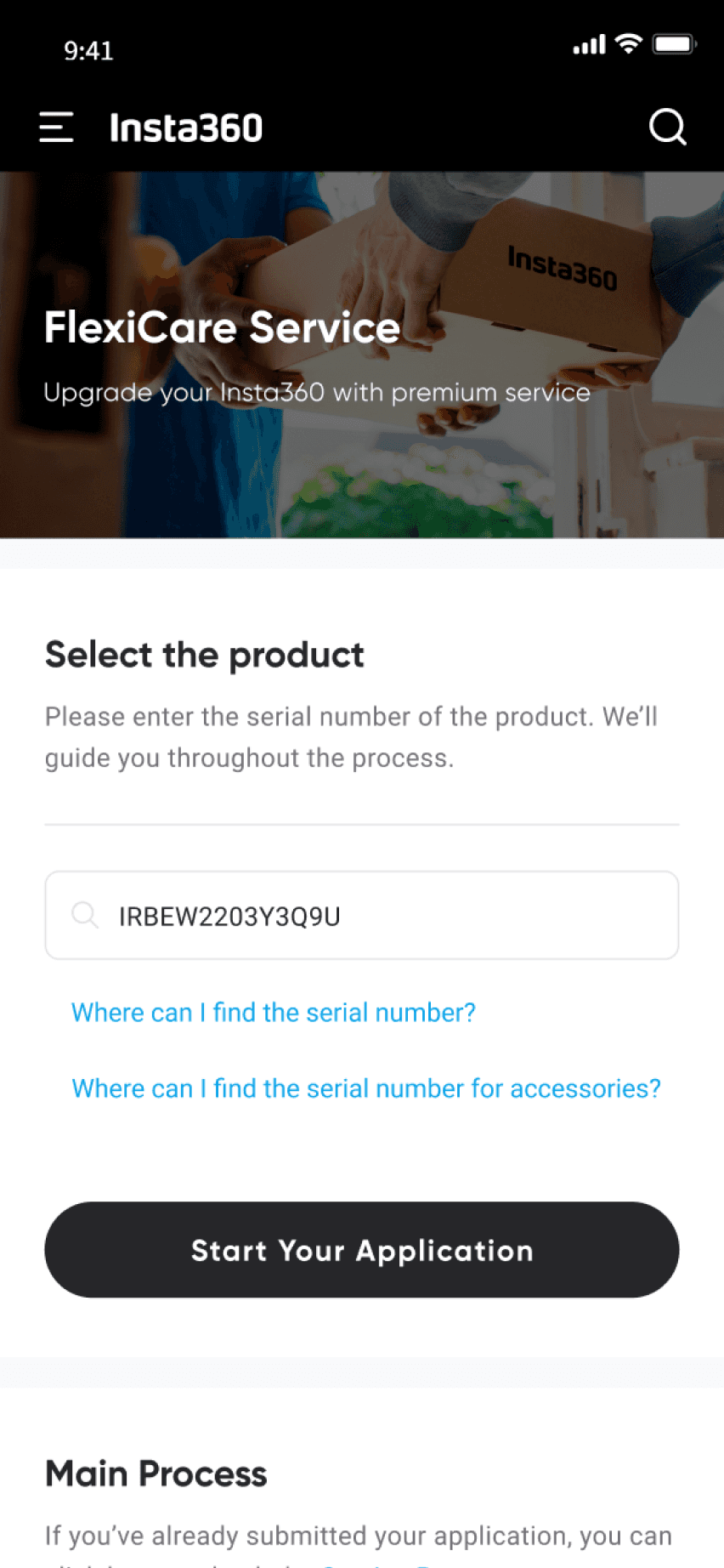
Repair Request | Camera Issue Page
User Problems
Poor Discoverability + Complex Workflows
In the UX audit, I found the FlexiCare request flow confusing and slow, as it was buried under the repair flow.
Though designed as a premium replacement service, it shared the same entry and steps as standard repairs.
This picture above shows the previous entry point for FlexiCare in the Support Homepage.
Opportunity
How might we revamp FlexiCare service flow into
a simpler, premium experience, that is separate from repair service and built for FlexiCare members?
Improvement Areas
Discoverability and Efficiency were identified as the key improvement areas. The following 2 mini cases explore how I addressed each.

Efficiency: Optimizing Workflows ⭐
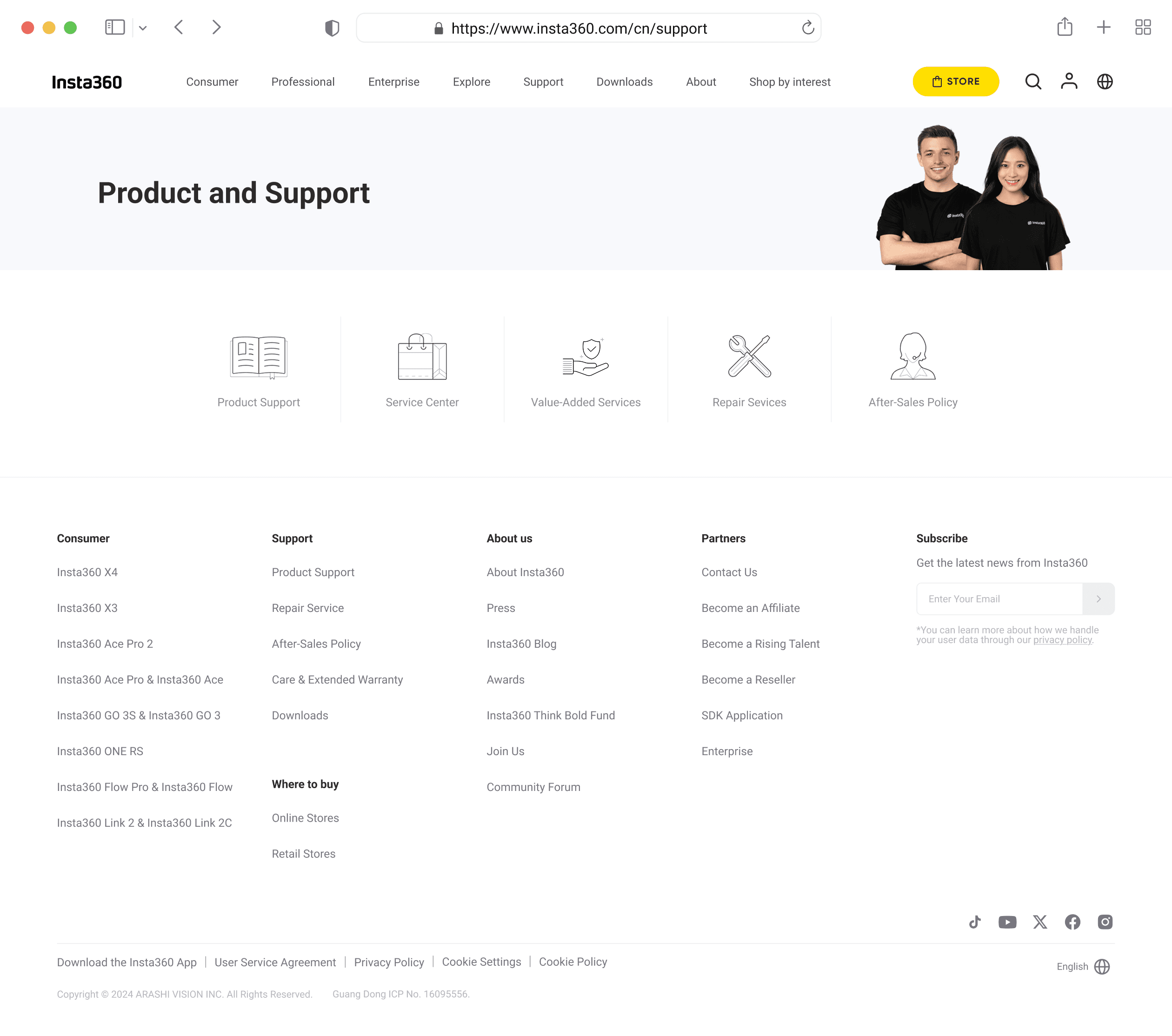
https://www.insta360.com/cn/support
Consumer
Professional
Enterprise
Explore
Support
Downloads
About
Shop by interest
STORE


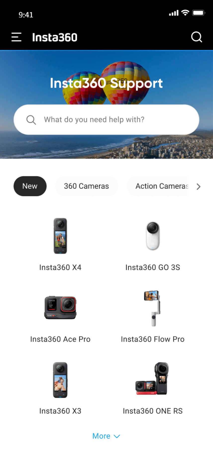
Insta360 Support
What do you need help with?
New
360 Cameras
Action Cameras
Handheld Gimbals
Webcams

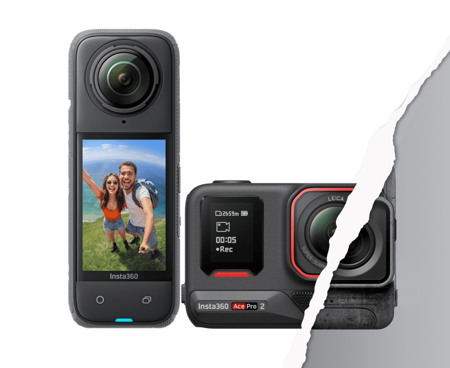
Insta360 X4

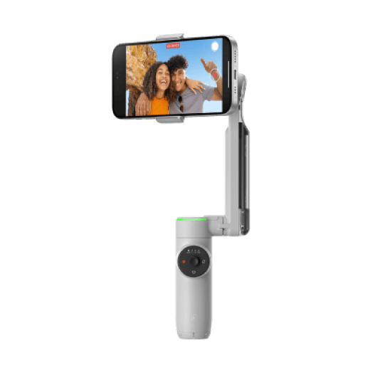
Insta360 GO 3S

Insta360 Ace Pro

Insta360 Flow Pro

Insta360 X3

Insta360 ONE RS
Show More
Quick Access
Repair Service
FlexiCare Service
Service Progress
123
Device Info Query
Repair Price
Insta360
Care Service
Insta 360+ Service Activation
After-Sales Policy
Show More
Insta360 Care Service
Providing comprehensive protection services for your device
Learn More
Contact Us
Online Chat
Office Hour: 24/7
Start Chat
Recommended
Technical support
service@insta360.com
Send Email
Phone
+1 800 6920 360
Office Hour: Mon-Fri 7:00-17:00 (PST)
Contact Us
@Insta360
Go to Facebook
Community
Participate in exchanges on hot topics
Join Discussion
Feedback
To provide you with better products or services
Give Feedback
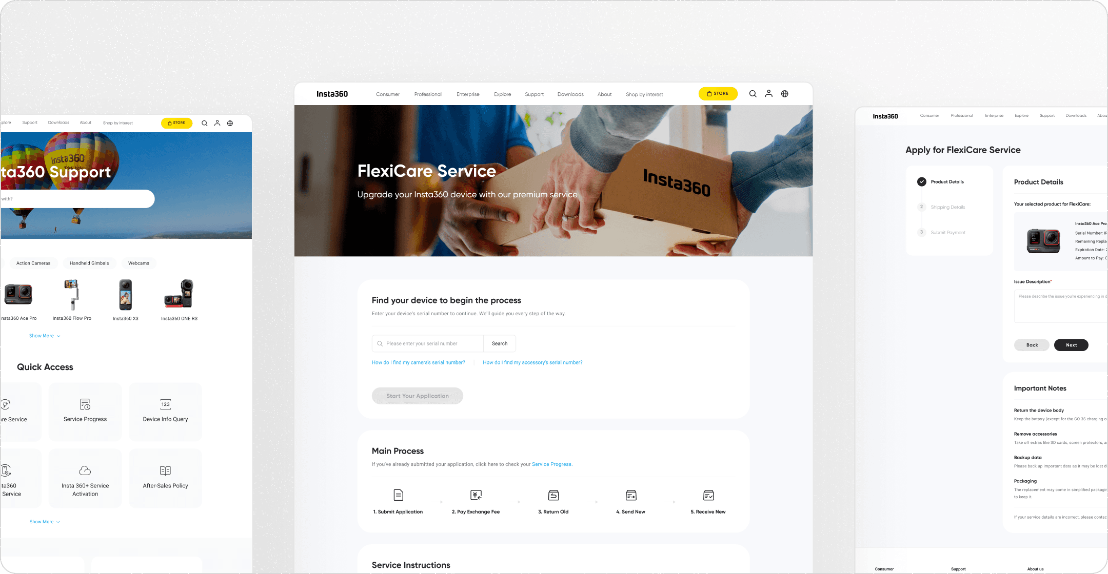
Discoverability: Service Page & Shortcut
Case 01: Optimizing Workflows
Pain Points:
Slow Turnaround + Irrelevant Steps
8-10 min
Long completion time
10~20 Days
Slow Service Cycle
63%
low Completion rates
Working with our analyst, we found the most time consuming/key drop-off steps, highlighted in orange, were:
Camera issue selection (too many inputs), Assessment & payment (long wait times).
Why users gave up halfway
“Why I need to write so many information that don't seem related to the FlexiCare service...”
“You have to select which camera to repair and all that stuff. It's really annoying and pointless.”
“I feel like I spent a long time filling out the form, especially the part where I had to fill in all the camera issues and logistics information. It took forever to complete.”
For Design
Only ask what’s relevant.
Shorten the service flow.
Make the experience effortless.
Proposed Directions
5 → 3 Steps
phase 1: Online Request
① Reduce Unnecessary Steps
② Payment is made when submitting Online Request (Not after Assessment), with a Fixed fee.
1 Week → 48h
phase 2: Device Assessment
① As it’s an exchange service, no repair is required.
② The new device is shipped by Staff within 24h of receiving the old one.
Revised Workflows ✍️
To reduce cognitive load, I worked with the support team to simplify the process by removing unnecessary steps & restructuring online forms.
data improvements
10 → 5 min
Ave. completion time
20 → 7 Days
Slow Service Cycle
63 → 75+%
Request Completion rates
Revised flow

Solution Snapshot
SERVICE PAGE → reducing confusion
Created a tailored entry point(service page) and sets clear expectations.

Ensure Qualification: Serial Number Check
Enhance Clarity: Services Instructions
Product PAGE → eliminating decision-heavy UX
Condensed to 1 step with basic product details and a short summary.
After vs. Before
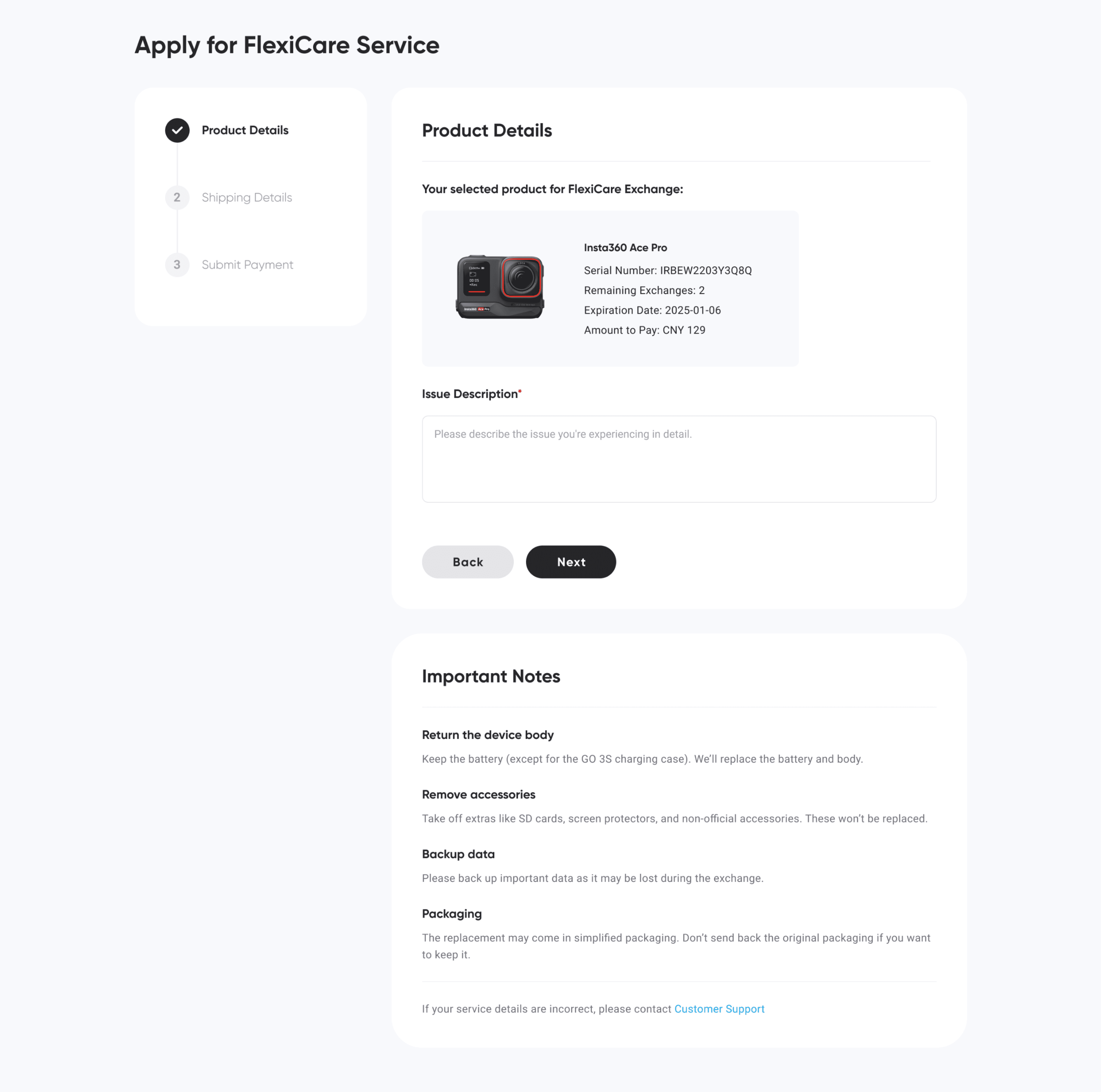
Short Summary, Simplified Input
After
Dropdown-heavy, 2-step

Before
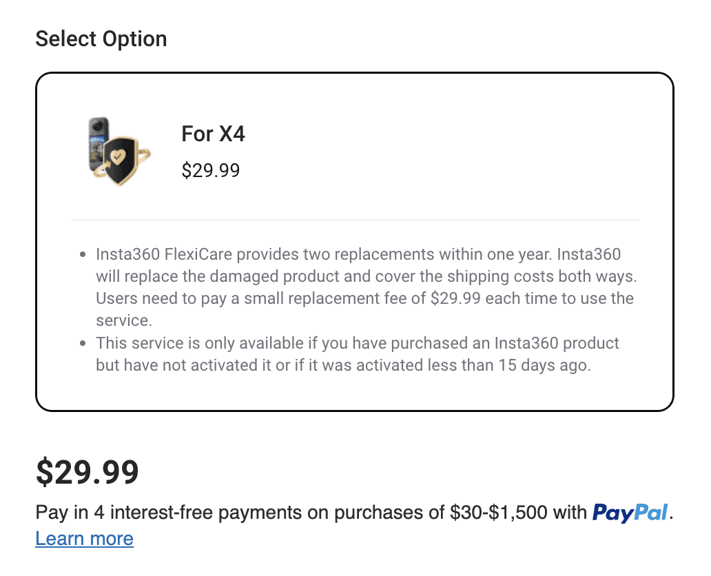
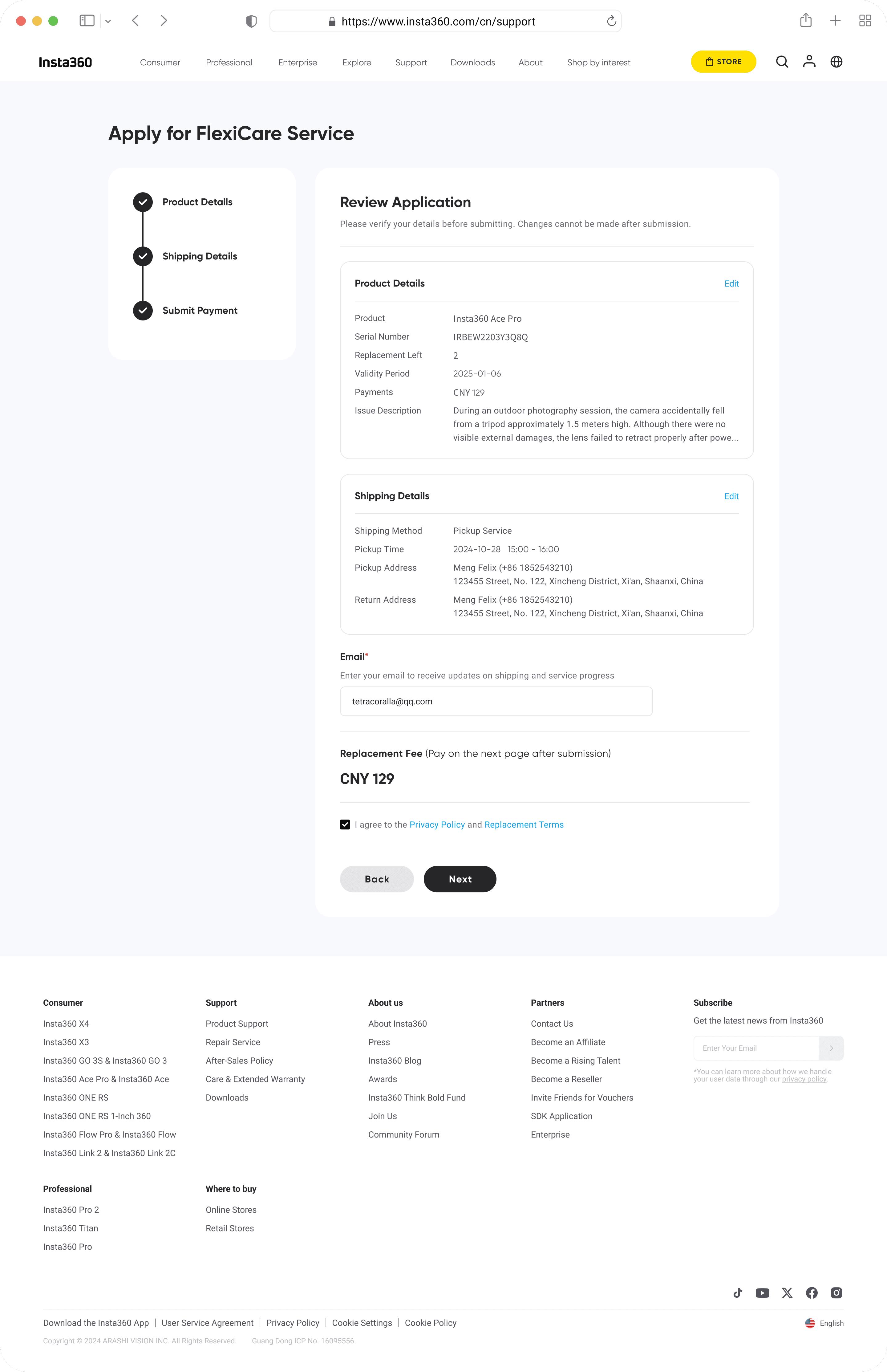
Review PAGE → reducing checkout hesitation
Replaced with a single review page with the one-time replacement fee.
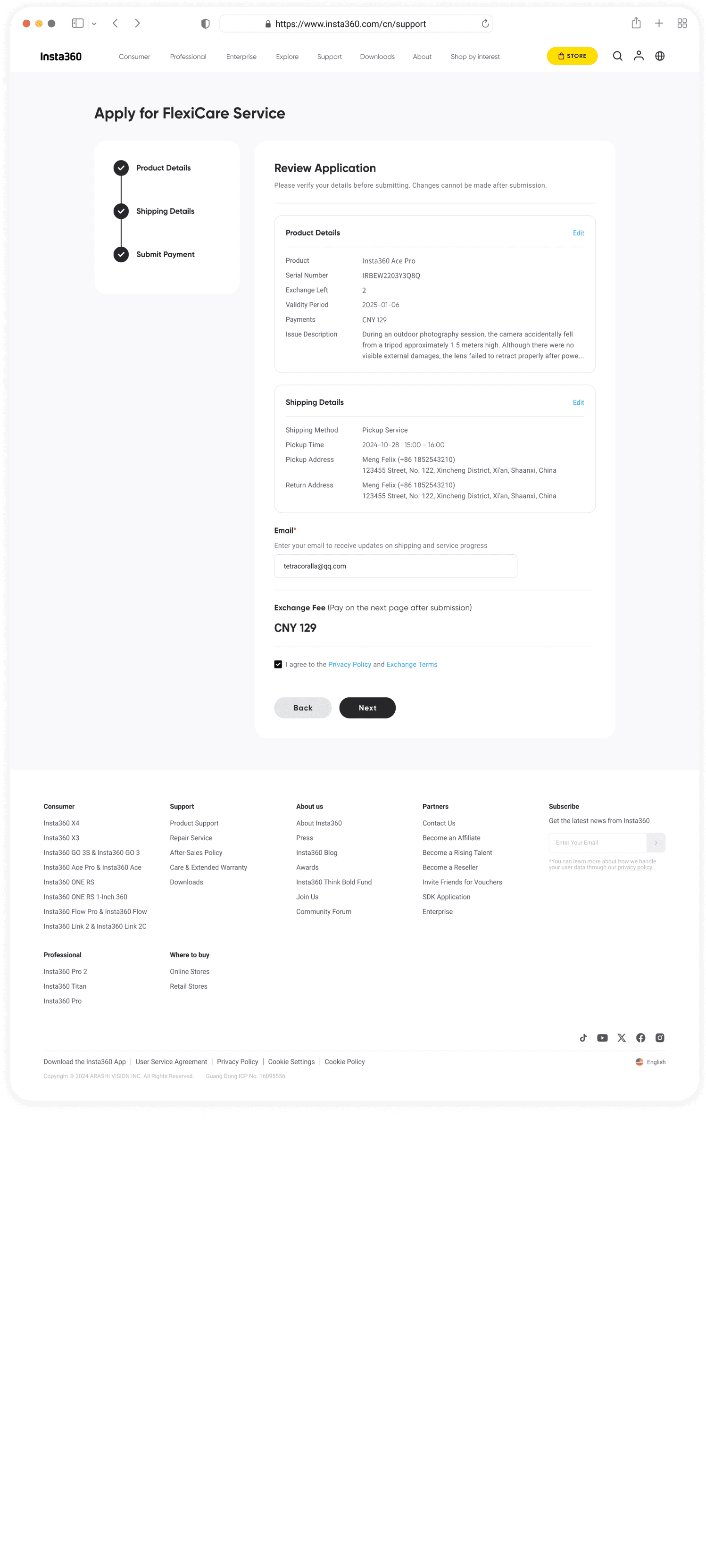
Single review page
One-time replacement fee
Designing for Mobile
Many users, especially outdoor enthusiasts, use our service during sports activities. Based on data, about 19% do so via the mobile web app.
As a result, I also paid attention to the mobile layout and interactions to ensure a seamless experience.
Here's a quick look at selected mobile UI.


Case 02: Improving Discoverability
Adding FlexiCare Service Page & Shortcut
The Current FlexiCare Users
> 20%
find it difficult to navigate to the Service
4 ~ 5
Clicks Required to Find FlexiCare
Original flow
Official Website
Support Homepage
Repair Service
Online Request
Select FlexiCare
Users begin at the official site, navigate to Support page, click through repair services, then go through up to 5 application steps just to find the hidden FlexiCare option.
Solution Snapshot
Revised flow
Official Website
Support Homepage
Flexicare Shortcut
Users begin at the official site, navigate to Support page, and click the FlexiCare shortcut to proceed.
Support homepage

Based on: 🔎 UX Audits
Add a search bar, making it easy to find answers.
Based on: 📈 Data + User Feedback
Put the most relevant services upfront for easy access.
Based on: 📩 Data + Business Needs + Feedback
Add shortcuts for the 8 most popular services.
Revised Portal & Flow
data improvements
-5%
find it difficult to navigate to the Service
5 → 3
Clicks Required to Find FlexiCare
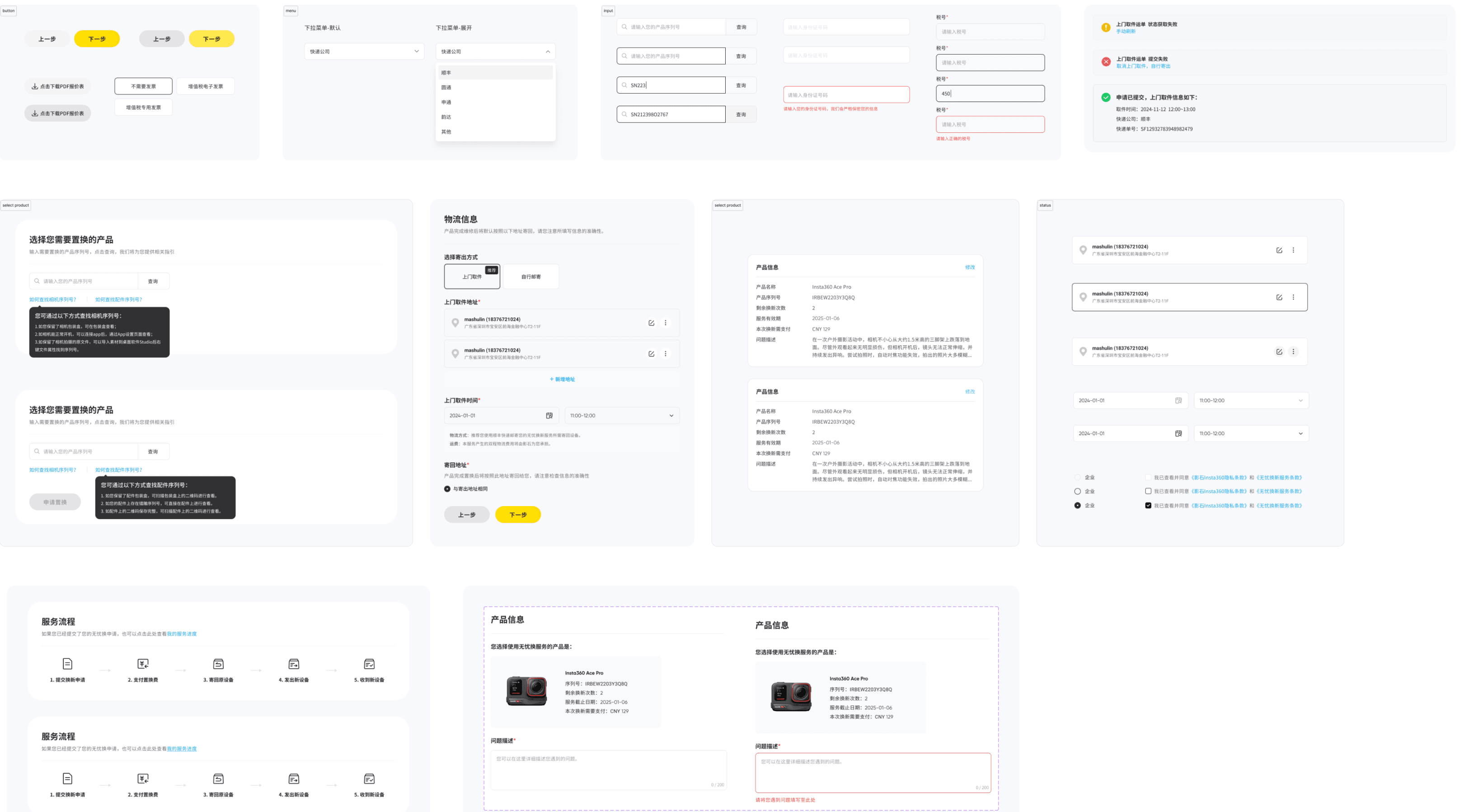
Final Design | Major Screens
Support homepage


Service page


Product page

Shipping page
submission review
Payment page


successfully submitted
PROGRESS page
Additional Visual Improvements
Design language
Shifted from yellow-heavy to a more black-dominant UI to convey professionalism and trust, as research shows it better represents these.

Primary Colors
Color scheme 1
Color scheme 2
☑️ Color scheme 3
English | Content
English | Title
Design system
Updating Interactions & Components
Icons
Layout
Variables & Components
Default
Hover
Click
Next Steps
User Satisfaction
Regularly review user feedback to make positive improvements.
Service Competion Time & Rates
Analyze behavior data (time spent on each page, drop-off rates) to identify friction points.
UX Audit
Organize regular usability tests to with both internal & external stakeholders.
Thank you for visiting👋🏻 Copyright © 2025 Jinjin Du, All Rights Reserved